At Roche Diagnostics GmbH Mannheim, a leading company in the field of healthcare and diagnostics, I played a key role in a major project. The company specializes in the development of innovative diagnostic solutions. In my position, I contributed to the development of a tool to facilitate the creation of a new diagnostic method.
The tool I developed enabled the efficient collection and visualization of measurement data, which significantly accelerated the development process of the diagnostic method. The project relied on agile methods, using SCRUM for project management and tools such as Confluence and JIRA for collaboration and tracking.
In terms of software development, technologies such as R-Shiny, Jenkins and AWS EC2 were used, demonstrating a commitment to cutting-edge solutions. The database infrastructure was supported by MongoDB to ensure a robust and scalable storage solution for the project.
Technologies React, React Native, Gitlab CI-CD, Google Firebase, AWS ECS
Keepoala is the first app that tries to avoid returns in two ways. Customers who avoid returns are rewarded via a loyalty program. A returns portal is used to ask customers why they have returned items. These insights are merged with various data connections of the online stores in one system. On a dashboard, the store can then see why returns occur and can use a wide range of adjustments to avoid this.
Technically, Keepoala consists of 16 pieces of software, including an iOS and an Android app, several WebApps in ReactJS that run in AWS ECS and AWS EC2 systems, R-Shiny apps for data analysis and NodeJS backends for connecting various logistics companies.
FunctionHR is a company that specializes in the development of a self-service HR platform. The platform is designed to provide a user-friendly interface for HR processes and utilizes technologies such as R-Shiny, React, HTML, Javascript and ReactJS. Within this framework, a comprehensive HR dashboard was implemented that presents key HR performance indicators.
As the CTO, I manage a team of 12 developers, provide support in all areas of platform development. The self-service tool allows the creation of surveys. The HR dashboard contains key metrics to assess organizational health and performance, including:
Employee satisfaction: measuring employee satisfaction through surveys and feedback mechanisms.
Turnover rate: Monitoring the rate of employee turnover within the organization.
Recruitment efficiency: Evaluation of the effectiveness of the recruitment process
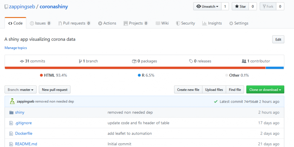
How did Corona spread? Using the animation feature of R-shiny this can be easily tracked.
COVID-19 is the major topic in all news channels. The place I live in is Munich, Germany. Within weeks Germany moved from 3 patients in the hospital next to my home, to have 20,000 patients. As a data-scientist, I did not only see the numbers but the exponential growth. I wanted to know:
How is the German government performing?
How do other countries stop the disease from spreading?
How long does it take for the disease to spread?
For how long is there exponential growth?
How many people do actually die?
To enable this I got pretty fast using shiny. With shiny you can select countries, date-ranges, make flexible tables with datatable. Great! Additionally, I used plotly to zoom into all plots, get better legends, make it easy to browse through my data. What else… shinymaterial makes the whole app look nice. It’s a great package and comes with easy use on mobile devices. I guess that’s it. Now I can answer all my questions by browsing through the app. It’s easy to see how well South Korea managed Corona for example. You can also see how long it took for people to die in German hospitals, while the outbreak was rather fast in Italy. Moreover, the app shows, that in the US up-to now (Apr 3rd) the spread is not really stopped.
Go to the app to see how your country performs:
If all this Corona data is too much for you, you can also check out the fun data section inside the app.
To build up the app I used shiny-modules. How to build modular shiny apps I explained several times already: App – from Truck and Trailer. This time I used standard shiny modules without classes. Each of the pages shown inside the app is such a module. So one for the map, one for the timeline charts, one for Italy….
To render the plots I only used plotly. Plotly allows the user to select certain lines, scroll into the plot and move a round. With few lines of code it is possible to create a line chart which can be grouped and colored per group:
plotly() %>% add_trace(
        data = simple_data,
        x = ~as.numeric(running_day),
        y = ~as.numeric(active),
        name = country_name,
        text="",
        type = if(type == "lines") NULL else type,
        line = list(color = palette_col[which(unique(plot_data_intern2$country) == country_name)])
)
The result looks like this:
An important feature I wanted to build in was a table, where a lot of measurements per country are available. I set up these measurements:
Maximum time of exponential growth in a row: The number of days a country showed exponential growth (doubling of infections in short time) in a row. This means there was no phase of slow growth or decrease in between.
Days to double infections: This gives the time it took until today to double the number of infections. A higher number is better, because it takes longer to infect more people
Exponential growth today: Whether the countries number of infections is still exponentially growing
Confirmed cases: Confirmed cases today due to the Johns Hopkins CSSE data set
Deaths: Summed up deaths until today due to the Johns Hopkins CSSE data set
Population: Number of people living inside the country
Confirmed cases on 100,000 inhabitants: How many people have been infected if you would randomely choose 100,000 people from this country.
mortality Rate: Percentage of deaths per confirmed case
With the datatable package this table is scrollable and searchable. Even on mobile devices:
Last but not least, I wanted to have a map that changes over time. This was enabled using the leaflet package. leafletProxy enables to add new circles everytime the data_for_display changes. The code for the map would look like this:
Last week (Feb 28th – Feb 29th) the celebration of 20 years R 1.0.0 took place in Copenhagen, Denmark. It turned out to be a fun conference. People told lots of anecdotes from the earlier days of R. Peter Dalgaard brought with him the very first CD with R-1.0.0.
First CD with R-1.0.0 and the signatures of the core team
Visitors had the possibility to meet and see more members of the R-Core team. Hadley Wickham’s spontaneous talk generated a lot of laughter. The location in the Maersk tower allowed a fantastic view over Copenhagen. I really enjoyed this well-organized conference. In the next few sections I’ll go through my highlights:
ggplot workshop from Thomas Lin Petersen
The workshop was really well structured. Thomas started by explaining the grammar of graphics that I had actually never heard of. It’s the basic idea behind ggplot. The naming conventions of all functions follow these principles. The grammar of graphic implies the order of function calls for a ggplot, too. You can read on it in this book or look for Thomas presentation. He hosted the workshop in RStudio cloud. It contained little tasks to solve and explanations of the basic ideas. You can find the project here, if you want to go through the workshop tasks on your own.
The basic components of the grammar of graphics
Peter Dalgaard on the history and future of R
Peter introduced the whole story of R. It was interesting to hear that until 1997 the whole developer team only worked remotely. There were people developing the R-core in Auckland (NZ), Vienna (Austria), Graz (Austria), Copenhagen (Denmark) and many more places. They all first met in Vienna in 1997 in person. Then decided to release R on the nerdiest date possible. The 29th of February 2000 is a date, that has three exceptions when to introduce a 29th in February (read more here). The first release of R did not only contain the R-core, but also the whole CRAN at this time burned onto a CD. This CD got copied 15 times and signed by all Core Team members. In Auckland it even has its own shrine. The highlight of this presentation was Peter releasing R-3.6.3 live in front of the audience. He uploaded it to CRAN and changed the CRAN website content. Here is a time-lapse video of the live-release:
Roger Bivand: How R Helped Provide Tools for Spatial Data Analysis
Roger showed in his presentation how he started in the year 2000 to do geographical data analysis. I was really surprised that all these packages exist for so long. In several projects, I used the packages to map sports data to maps. It was great to see that the API has changed a lot, but his team made these things work for over 20 years now. I highly recommend looking into the sf package now, if you want to start with such things.
Mark Edmondson – Google Cloud
For me Mark’s talk was a real wow talk. In my open-source projects, I always want to allow other users to reproduce my code, or see how my package was checked. Thus, I used the Docker-based tool Travis-ci. Mark is working out packages for the Google Cloud. He showed that the Google cloud can easily allow you to trigger and run build processes. But the Google Cloud also offers to run such processes on nearly any kind of event. He presented a tool that triggers a plumbr API call upon just uploading a file to Google Cloud Storage. This was a really impressive piece of software. As you can imagine updating any kind of dashboard based on such events. His package googleCloudrunner also has a very nice API to fulfill such tasks. Wonderful.
Julia Silge – Text Mining with Tidy Data Principles
Julia is really great at giving entertaining talks. Her talk was full of fun facts of what you can do with text-mining. Her great work included showing what movie programmers identify with and which states are overrepresented in American song lyrics. Her package tidytext allows an easy and really flexible analysis of any kind of text data. Julia is a big Jane Austin fan. Her analysis of books are amazing. She made it possible to predict which book a phrase comes from. This was possible only on training an algorithm on different Jane Austin books. My favorite algorithm was the topic finder. It could easily find in reddit analysis, which words belong to certain topics. This would allow for automatic assignment of topics for articles. You can find such work explained here.
Hadley Wickham – Why R is a weird language.
Winston Chang got sick and that is why Hadley Wickham jumped in to give a remote talk. He went over three aspects, why R is weird. Functions can be stored nearly anywhere and you can make everything a function. You can even make a function return a function. Not too crazy. Environments really allowed him to play a lot. He actually overwrote the + operator inside an environment, that he used to execute a function. You can even change the environment of just this single function called add.
Hadley Wickham overwriting function environments at Celebration2020 in Copenhagen
Expressions are a cool way to store calls. I use them to do reproducible code. But you can also use them together with environments to run the same call with different inputs. Hadley’s whole talk was live-coding. It was impressive how he can make people laugh because he puts in great hacks. There were fantastic things he used to overwrite even the "(" inside R. The code from this talk can definitely be used to mess with your co-workers. There will be some people in trouble in the next weeks.
Heather Turner- R Forwards
Heather grabbed an important aspect from Peter’s talk. The R-Core consists 1) of old people 2) of men 3) of people from highly developed countries. R Forwards is working on the integration of more diverse people into the R community. This not only includes projects like R-Ladies and AfricaR, but also projects to enable blind and deaf people to use R. Her talk presented in which direction I would like to see R going. It should be a more democratic, more transparent language. It was impressive that she used automatic captions during her whole talk, allowing deaf people to follow. One important point of her talk was opening up the R-core for more people. Right now it is pretty hard to collaborate on the R-core. Python went over this problem by several steps. Additionally, the R Forwards project will enable more ways to learn R and to ask questions. Stackoverflow, github, and CRAN do not contain content that helps total beginners. R Forwards wants to change that by workshops, setting up easier guides to work with R, creating a kind of mentoring program, finding a tool where people can ask any kind of questions. Heather presented brilliant ideas. Check them out at: https://forwards.github.io/
This article is just an excerpt of what happened around the conference. So please also read on the topics I missed out:
im Jahr 2019 habe ich relativ viel Zeit im Flugzeug verbracht. Deshalb dachte ich mir, da gehören meine Alben hin. Denn dort hört man ja sehr sehr viel Musik, wenn man keinen Film guckt oder arbeitet. Die Auswahl ist sehr soulig jazzig geraten, mit einigen Pop Nuancen. Viel Spaß beim Hören.
Spotify Playlist
Youtube Playlist – hauptsächlich live
(1) The Dip – The Dip
116 plays, 10.5x ganzes Album
(2) Hackney Colliery Band – Sharpener
118 plays, 9.8x ganzes Album
(3) St Paul and the Broken Bones – Sea of Noise
109 plays, 7.2x ganzes Album
(4) Izzy Bizu – A Moment of Madness
124 plays, 6.88x ganzes Album
(5) Lizzo – Cuz I Love You
96 plays, 6.85x ganzes Album
(6) The Dip – The dip delivers
67 plays, 6.7x ganzes Album
(7) The Bamboos – Live at Spotify Sessions
93 plays, 6.64x ganzes Album
(8) Tom Misch – Geography
85 plays, 6.53x ganzes Album
(9) Bonobo – The north borders
80 plays, 6.15x ganzes Album
(10) Moop Mama – M.O.O.P. Topia
86 plays, 6.14x ganzes Album
(11) Andreya Triana – Life in Colors
67 plays, 6.1x ganzes Album
(12) Werkha – Colours Of A Red Brick Raft
61 plays, 5.1x ganzes Album
(13) Pimps of Joytime – Third Wall Chronicles
49 plays, 4.9x ganzes Album
(14) Clueso – Weit weg
97 plys, 4.85x ganzes Album
(15) Bonobo – Migration
58 plays, 4.83x ganzes Album
(16) D’angelo – Vodoo
54 plays, 4.5x ganzes Album
(17) Rebirth Brass Band – Rebith of New Orleans
49 plays, 4.45x ganzes Album
(18) Bilderbuch – Vernissage My Heart
35 plays, 4.37x ganzes Album
(19) Hot 8 Brass Band – Vicennial
49 plays, 4.08x ganzes Album
(20) Moop Mama – ICH
52 plays, 4x ganzes Album
Noch ein bisschen Statistik. Also vor allem habe ich dieses Jahr Musik während der Arbeit am Nachmittag gehört. Außerdem sieht man schön, wie ich im Juni im Urlaub war. Die zweite Jahreshälfte hat anscheinend auch nochmal ganz schön die Statistik gerockt.
Hörstatistik für Monate und Tage im Jahr 2019
Hör-Uhr für meine last.fm Statistik
Alle Statistiken sind mit meinem R-Paket analyze_last_fm erstellt.
When Hadley Wickham published dtplyr 1.0.0 last week, I was super excited. Moreover, I wanted to know, if it really is a useful package. Therefore I performed some tiny research being presented in this blog entry.
Ok. So dtplyr gives you the speed of data.table with the nice API of dplyr. This is the main feature. You will see this in the following code. The speedup of dtplyr should allow converting variables in large scale data sets by simple calls. So I first constructed an example call which is partly taken from Hadley Wickham`s blog entry:
n <- 100
# Create a word vector
words <- vapply(1:15, FUN = function(x) {
  paste(sample(LETTERS, 15, TRUE), collapse = "")
}, FUN.VALUE = character(1))

# Create an example dataset
df <- data.frame(
  word = sample(words, n, TRUE),
  letter = sample(LETTERS, n, TRUE),
  id = 1:n,
  numeric_int = sample(1:100, n, TRUE),
  numeric_double = sample(seq(from = 0, to = 2, by = 1/(10^6)), n, TRUE),
  missing = sample(c(NA, 1:100), n, TRUE)
)

# Convert the numeric values
df %>%
  filter(!is.na(missing)) %>%
  group_by(letter) %>%
  summarise(n = n(), delay = mean(numeric_int))
The call shown is the one used within dplyr. In dtplyr a lazy evaluation term needs to be added. At the end of the dplyr call a %>% as_tibble() is needed to start the evaluation. In data.table the call looks totally different.
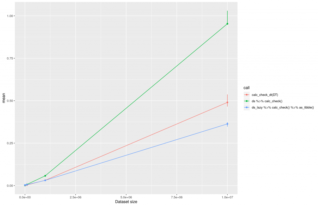
To evaluate the execution I created testing datasets of different sizes. The smallest dataset will contain 100 rows. The largest dataset 10E7 rows. Afterward I ran the data conversion operations and logged the time of execution using the bench package and 1000 iterations. All calculations were performed on an AWS t3.2xlarge machine hosting therocker/tidyverse docker image. This is the result of the calculations plotted in a linear manner:
The execution time of data transformations using dplyr, dtplyr and data.table plotted in a linear manner.
One can clearly see that dtplyr (ds_lazy …) and data.table (red line, calc_check_dt) increase nearly linear over time. Both seem to be really good solutions when it comes to large datasets. The difference of both at 10E7 can be explained by the low number of iterations being used at benchmarking. This post should not provide perfect benchmarks, but rather some fast insights into dtplyr. Thus, a reasonable computing time was preferred.
Please consider, conversion and copying of a large data.frame into a data.table or tibble may take some time. This shall be considered. When using data.table all datasets should be data.tables right from the start.
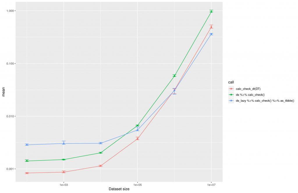
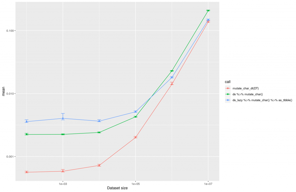
From the linear plot you cannot see at what point it is useful to use dtplyr against dplyr. This can thus be seen in the following plot:
The execution time of dtplyr, dplyr and data.table plotted for the conversion of different datasets in a logarithmic manner.
The above image clearly shows that it is worth using dtplyr over dplyr in case there are more than 10E4 rows inside the dataset. So if you never work with datasets of this size it might not be worth considering dtplyr at all. On the other hand, you can see the data.table package itself is always the fastest solution.
As in my project we do not just deal with numeric transformations of data, but also character transformations, I wanted to know if the dtplyr package could be helpful for this. The conversion I performed for character strings looks like this:
The calculation results are similar to those gained with numeric conversions
Inside this plot the difference between dplyr and data.table is nearly invisible. All methods increase the computing time in linear relation to the data set size.
The execution time of large scale data conversions for character evaluations with dtplyr, dplyr and data.table.
For character transformations the performance of dplyr is pretty good. It is just useful to use dtplyr for datasets with >10E5 rows. In case of the largest dataset tested in this approach with 10E7 rows, dtplyr is twice as fast as dplyr.
Conclusion
The code you need to write to use dtplyr is really simple. Especially if you are like me dplyr native and do not want to start using data.table. But there will be a lot of use-cases where it is not necessary or not even useful to use the dtplyr package. So before you start writing fancy dtplyr pipelines, think about the necessity.
Einen Freitag Abend kann man sich eigentlich kaum besser vorstellen. Lizzo war in der Stadt, und wer es nocht nicht wusste, “That bitch” will rock you!. Zunchst einmal schickte sie ihre DJane Sophia Eris vor um so richtig einzuheizen. Dadurch war man eigentlich schon vor dem Konzert ganz gut warm.
Doch der Hammer folgt erst, wenn Lizzo die Bhne betritt. Sie hat eine unglaubliche Prsens und begeistert vor allem dadurch, wie sie sich feiern lsst. Selten hat man jemanden so schn mit wehenden Haaren vorm Publikum auf Applaus warten sehen. Doch zwischen diesen Einlagen rauschen die Songs nur so vorbei. Die Big Girls kommen regelmssig dazu um aus einer wahnsinnigen Stimme mit einer unfassbar grossartigen Person auch noch eine unendlich geile Show zu machen. Jeder Beat geht nicht nur in die Beine der Big Girls, sondern auch in die eigenen. Wer sich das nicht vorstellen kann, hier mal ein kleiner Ausschnitt vom Glastonbury:
Das Publikum kann in Mnchen hnlich wie in England jede Zeile mitsingen. Das ist auch dringend notwendig und wird von Lizzo verlangt. Denn auf der Bhne konzentriert sich die Show manchmal nur auf Twerk Skills und Love, Love, Love. Vergesst niemals euch selbst zu lieben. Wenn ihr das so gut knnt, wie Lizzo, steht euch vielleicht auch so eine grosse Karriere und so eine fantastische Show bevor.
Falls Lizzo mal bei euch vorbei kommt, auf jeden Fall mitnehmen, mitfreuen, mittanzen, mitlieben, mitgeniessen.
Using the amazing package rayshader I wanted to render a video of my tour to Alpe d’Huez. Now I created an R package that can use any GPX file and return a 3D video animation from it.
In July 2019 my friend Tjark and I went to France to cycle the 21 hairpin bends to Alpe d’Huez. The climb has a distance to the summit (at 1,860 m (6,102 ft)) of 13.8 km (8.6 mi), with an average gradient of 8.1% and a maximum gradient of 13%. Two years before we climbed up the amazing Mont Ventoux in Provence, and now we wanted to do Alpe d’Huez. Due to a lack of Hotels, we stayed up at the village itself. We started our tour facing down the Col de Sarenne, via Mizoën and through the valley up the 21 hairpins. It was hot, it was steep, it was exhausting.
I was not at my best fitness. But I am a data scientist and I wanted to know how “slow” was I? There are several ways to find out. I could look at my average speed, a line chart or do a video. Even Strava, the app I used for tracking, has a built-in app to make a video called FlyBy. This tool is just two- dimensional. But on twitter and github I found the amazing package rayshader. It allows creating a 3D landscape out of any elevation data. Moreover, you can overlay your landscape with different maps or light conditions. So I thought, why don’t I put my GPS data on top of it? Said and done:
In the next chapters, I will explain how you can create your own video from any .gpx file with my package rayshaderanimate.
Downloading Elevation data
rayshader 3D graphic of the landscape around Alpe d’Huez
My first problem was getting the elevation data around Alpe d’Huez. Thus I found the great package raster. You can download elevation data for a boundary box all over the world by calling:
I wrapped this function inside my package rayshaderanimate. It would allow you to download the data. It then filters the data for the boundary box (not done by raster). Afterward, you can transform it into a rayshader readable format:
The next task for me was to read in my gps data. The plotKML package has a function for that. I wrapped it inside my package. It outputs my GPX file as a table with longitudinal, latitudinal coordinates and a time vector. The table gets stored in the gpx_table variable and the boundary box gets stored inside the bbox variable.
Making a ggplot video from elevation data and GPS data
Animating the line of the GPS data means painting it on top of the landscape. I came to the conclusion that I need to paint every video scene image by image. Meaning if the line should move for two seconds, I would need 48 images to get a frame-rate of 24 images per second.
I did not find any better way than creating a 2D graphic of the elevation data and rendering it as a 3D ggplot. Meaning each step of the video has to be rendered as a ggplot. Afterward, using rayshader I make a 3D image out of this. I take a snapshot and continue the process with a longer line of my GPS data.
The trouble with GPS data is that it does not get captured in equally distributed time frames. Sometimes my phone would capture my position every second, sometimes every 30 seconds. So first I needed to create a function that equally distributes the time from my GPX table. The function is inside my package:
where number_of_screens is the number of frames going into the video. In my case, I wanted to capture ~300 screens to make it a ten second video. For each screen, I needed to paint a ggplot. Ggplot needs the elevation data in a long format. This call will transform the elevation data to a ggplot format:
elmat_long <- get_elevdata_long(el_mat)
From the elevation data, the gpx table and the video indeces I can create every snapshot by rendering a ggplot:
As you can see I inserted a column rel_speed inside the gpx table to make faster pieces of the track darker. The x-axis label will show the real time of each image being captured.
To render this plot as a 3D graphic rayshader provides the function plot_gg. The image changes by tweeking angles and zooms. To take a picture from the 3D graphic I used the render_snapshot function.
rayshader image of a 3D landscape with a GPS data overlay and time label on the x-axis
The difficult part is rendering all 300 images into a video. ffmpeg provides a simple API under Windows for this task. The links to all images get stored inside a txt file. From this text file ffmpeg can render the video as an mp4.
I also added functionality to render videos as gifs inside my package. Although I do not recommend rendering them as a gif. The gif files can become rather large. For more details on creating the video, please read the package vignette of rayshaderanimate package.
How about a storytelling video?
The video rendered up-to-now does not look like the video I showed at the top. I wanted to use the rayshader sphere shade with a map overlay for the video, too. Therefore I read the article at https://wcmbishop.github.io/rayshader-demo/ . While trying an image overlay with my data from Alpe d’Huez I noticed, that just the EUDEM data has a resolution that is high enough to render a sphere shade.
But there were certain tweeks needed. I’ll not describe them in detail, but the major problem was rayshader beeing programmed for having data from the US, meaning west of Greenich Meridian. My data points are located east of Greenich Meridian. I created the function get_elevdata_listto overcome this problem.
My function get_image_overlaycan be used to derive an overlay image for a certain area. Adding the overlay image can simply be done by using the functionalities of rayshader, meaning add_overlayand plot_3d.
# Format elevation data for west of Greenich
elevation_data_list <- get_elevdata_list(el_mat_eudem)
elevation_matrix <- elevation_data_list$elevation_matrix

# Calculate shadow and water
elevation_matrix %>%
    sphere_shade(texture = "desert") %>%
    add_water(detect_water(elevation_matrix), color = "desert") %>%
    add_shadow(ray_shade(elevation_matrix,
      zscale = 3, maxsearch = 300), 0.5)

# Receive Overlay Image from arcgis with a specific boundary box
bbox <- get_bbox_from_gpx_table(gpx_table, arcgis = TRUE)
overlay_img <- get_image_overlay(bbox_arcgis)

# Plot 3D with overlay image
elev_elem <- elev_elem %>% add_overlay(overlay_img, alphalayer = 0.5)
elev_elem %>%
    plot_3d(elevation_matrix, zscale = 15, fov = 1, theta = 280,
     zoom = 1.5, phi = 60, windowsize = c(1200, 800))
3d rayshader landscape with image overlay in the French Alps
Now the only things missing are the place markers and the route. Both can be added from the gpx_table. To do this I needed to map the latitude and longitude of the gpx_table to my elevation matrix resulting in lat_idx and lon_idx. Additionally, I added a label to some places, as you can see in this case it is place number 100.
for (i in 1:100) {
  render_label(elevation_matrix,
    x = gpx_table[1, "lon_idx"],
    y = gpx_table[1, "lat_idx"],
    z = 100, zscale = 15,
    text = NULL, textsize = 15,
    linewidth = 6, freetype = FALSE,
    color = "#0f9ad1")
}
render_label(elevation_matrix,
   x = gpx_table[100, "lon_idx"],
   y = gpx_table[i, "lat_idx"],
   z = 2200, zscale = 15,
   text = gpx_table[100, "label"],
   textsize = 1, linewidth = 7, freetype = FALSE,
   color = "#0f9ad1", family = "mono", antialias = TRUE)
3d rayshader landscape with route and label in the French Alps
I perform this process for each single point of the gpx_table. At each point I take a snapshot by rayshader::render_snapshot. All snapshots will be stored and converted to a video by ffmpeg. I added some additional features as an elevation profile or a title image. Those were added to the snapshots using magick::image_append. All these features went into my function video_animation_rayshade. This function will create a whole video with a flyover over the map, adding the points and the elevation profile.
Why the video?
Two-dimensional animations cannot really describe the loss of speed uphill. The human perception of mountains is not represented by elevation lines. But elevation lines are the only way to visualize them in two-dimensional plots. The rayshader package allows a way better impression height and steepness. This is why I wanted to use it to visualize my climb to Alpe d’Huez.
Hairpin bends at the mid range of the Alpe d’Huez climb
Now please enjoy watching the video of my cycling climb. You can truly see at the end of the video how I was suffering from the heat at the 21 hairpins. The last passage of the video describes me being slow. The color of the GPS line is bright and it takes long until it reaches the mountain top. Just to give you an impression I added a photo of the lowest 8 hairpins.
Final words
me cycling up to Alpe d’Huez
The package to create such videos is open-source and available on:
Mount Whitney is the tallest mountain in the contiguous United States and you need a permit to climb it. These permits are limited. But from time to time, somebody will return his permit. It will show up on the permit website recreation.cov. I wanted to get one of those and will tell you how.
A friend of mine had a time window of two weeks to get a permit for Mt Whitney. I did not really know about this mountain until he came up with the trip. Mt. Whitney is located in California and 14,505 ft (4,421 m) above sea level. As a lot of people want to go there every year. The USDA Forest Service decided to limit the number of permits to hike the mountain. To get a permit, you simply go to this website and check if your date with the # of hikers is available.
Mt. Whitney permit website (2019 Oct 3rd)
You will notice pretty fast, that if you are not an early bird, all permits for your desired date are gone. Now you have three choices. One, resign and don’t hike the mountain. Two, check the website by yourself every day, to see if new or returned permits are available. Three, get a bot or browser automation to work that checks the permits for you. My friend decided to ask me for the third option. And as I have some experience with RSelenium (just recently presented at EARLconf), I wanted to try this approach.
First I wanted to run my bot on the cloud. Moreover, I wanted to get a reproducible environment. So I decided to follow the vignette approach of RSelenium. This means using a docker container for Selenium. So my first task was to spin up two docker containers. The first one should run Selenium, the second one should run R and python to access it.
Spinning up the Selenium container is simple:
docker run -d -p 4445:4444 --name seleniumcontainer --net mynet selenium/standalone-chrome
I used a shared network between the docker containers called mynet . This allows the two docker containers to find each other in the network, even by names.
The second docker container must consist of three files.
run_tests.R to execute my RSelenium calls
sendmail.py to send emails from python
DockerFile to build a docker container
The Dockerfile needs to look like this:
# alpine-python-ecmwfapi
FROM rocker/tidyverse:3.6.0
MAINTAINER zappingseb "sebastian@engel-wolf.com"

RUN R -e "install.packages(c('RSelenium'), repos='https://cran.rstudio.com/') "

RUN apt-get update -qq \
  && apt-get install -y \
  python-pip \
  vim

RUN pip install pytest-shutil
RUN pip install --upgrade numpy secure-smtplib email

COPY run_tests.R /tmp/run_tests.R
COPY sendmail.py /tmp/sendmail.py

RUN apt-get update && apt-get -y install cron
RUN echo "0 */12 * * * root Rscript /tmp/run_tests.R" >> /etc/crontab
RUN service cron start
I used tidyverse docker container and installed the RSelenium package. Additionally, I installed python secure-smtplib and email . I also already added a cronjob to my docker container. This cronjob will run the web crawler every twelve hours by:
RUN apt-get update && apt-get -y install cron
RUN echo "0 */12 * * * root Rscript /tmp/run_tests.R" >>
  /etc/crontab
RUN service cron start
Now I would like to spin up the docker container. But my sendmail.py and run_tests.R files were missing. Let’s create them
Using RSelenium to crawl permits
To use RSelenium you first need to connect to the Selenium server. It runs in the other docker container. To connect to it run:
The name seleniumcontainer will be automatically identified as long as the container runs inside mynet. Two steps will lead to the Mt. Whitney permit website. Opening a browser and navigating to the website:
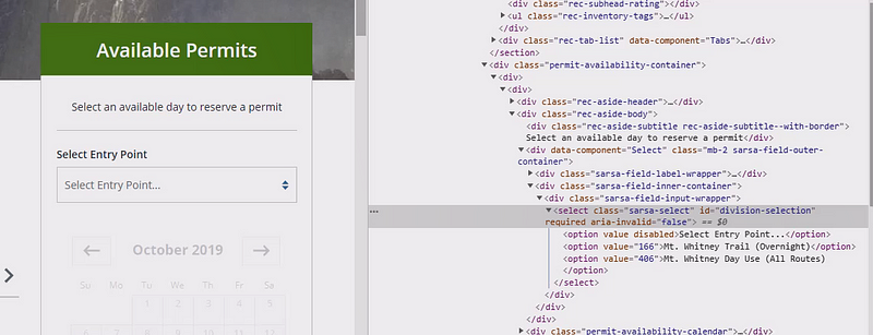
The much harder part is to find the elements to click on. So first I noticed, that I need to click on the option “All Routes”, which was the third one from the dropdown menu:
Mt Whitney dropdown menu HTML code
This option can be accessed by its id . This id is division-selection . By clicking on the element with the id , the dropdown will open. After the dropdown is open, you need to click on the 3rd option element available on the website. With these 4 lines of code you can realize it using RSelenium:
As you can see findElements returns a list of webElements with the desired attributes. clickElement is a method of such a webElement and will basically click the element.
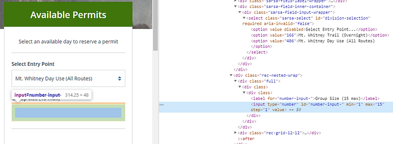
This was the easiest part of browser automation steps. The much harder part is entering the number of hikers. The safest way to change them is not only to type into the text field but also to use javascript to change its value. The field number-input- will be used for this.
Mt Whitney numeric input
To change the value I used the following code:
el_3 <- remDr$findElements("id", "number-input-")
# executing a javascript piece to update the field value
remDr$executeScript("arguments[0].setAttribute('value','1');"), list(el_3[[1]]))
# clearing the element and entering 1 participant
el_3[[1]]$clearElement()
el_3[[1]]$sendKeysToElement(list("1"))
You can clearly see that I wanted one single permit for the mountain. The javascript piece ran on the webElement itself, which was stored in el_3[[1]] . For RSelenium I prefer finding elements with the remDr$findElements method. Afterward, I take the first piece if I am sure that there is just a single element. The methods clearElement and sendKeysToElement remove old values and enter the value needed. The API of sendKeysToElement is a bit weird, as it requires a list of keys, instead of a string. But once used, it is easy to keep your code.
Interact with the permit calendar
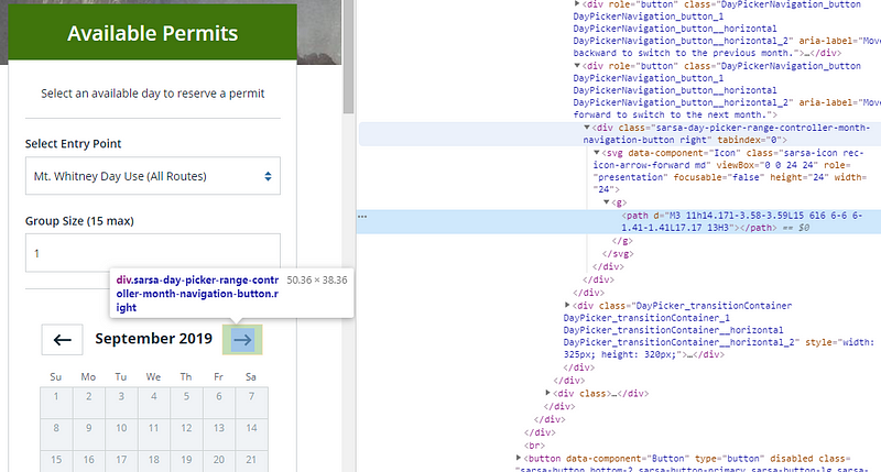
After these steps, the calendar with permits gets activated. I wanted to get a permit in October 2019. So I needed to click on “NEXT” until October shows up.
Mt Whitney next button
I build a loop to perform this task using the while command
# Get the initial month shown
month_elem <- remDr$findElements("css selector", ".CalendarMonth_caption strong")
month <- month_elem[[1]]$getElementText()
# Loop to until the October calendar is shown
while(!grepl("October", month)) {

  el_4 <- remDr$findElements("css selector", ".sarsa-day-picker-
    range-controller-month-navigation-button.right")
  el_4[[1]]$clickElement()
  Sys.sleep(1)
  month_elem <- remDr$findElements("css selector",
    ".CalendarMonth_caption")
  month <- month_elem[[2]]$getElementText()
}
The element containing the month was had the tag class="CalendarMonth_caption"><strong>...</ . I accessed this with a CSS selector. Upon clicking the next button, which had a specific CSS class, a new calendar name shows up. It took me a while to find out that the old calendar month is not gone. Now the second element has to be checked for the name. So I overwrite the month variable with the newly shown up heading of the calendar.
Derive the first available date from the calendar
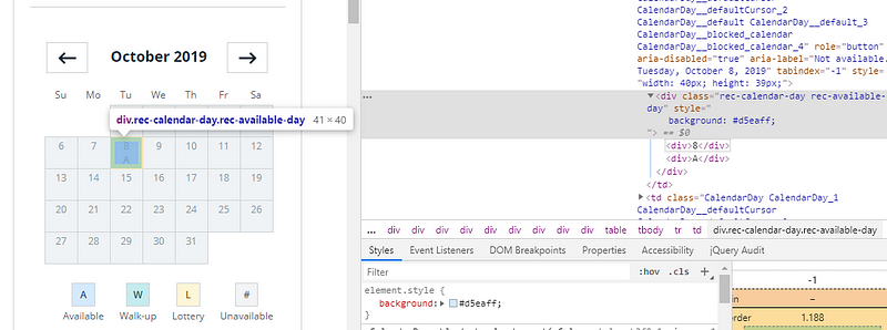
Finding an available day as a human is simple. Just look at the calendar and search for blue boxes with an A inside:
Calendar with available day at Mt Whitney
For a computer, it is not that easy. In my case, I just had one question to answer. What is the first date in October 2019 to climb Mt. Whitney?
Thus I searched for any entry with the class rec-available-day . In case any entry was there, I got the text of the first one and took all characters before a line-break. This extracted the number of the date. Now, wrap this up and send an email with the date:
fileConn<-file("/tmp/output.txt")
writeLines(paste0("The earliest day for Mnt Whitney in ", month[[1]], " is: ", earliest_day, "th of October 2019.\n\n-------------------\n"))
close(fileConn)
# Write an email from output.txt with python
system("python /tmp/sendmail.py")
Activating the docker container
Once the script was finished I wrapped up all files in my GitHub repository (zappingseb/mtwhitney). They will help me by sending an email every 12 hours. From there I went back to my docker server and git cloned the repository. I could then spin up my docker container by running:
and test the script one time by connecting to the docker container:
docker run -it mtwhitney /bin/bash
and running the script with:
sudo Rscript /tmp/run_tests.R
I got an email. After receiving the email I was sure the script will run and disconnected using Ctrl + p and Ctrl + q .
Learnings
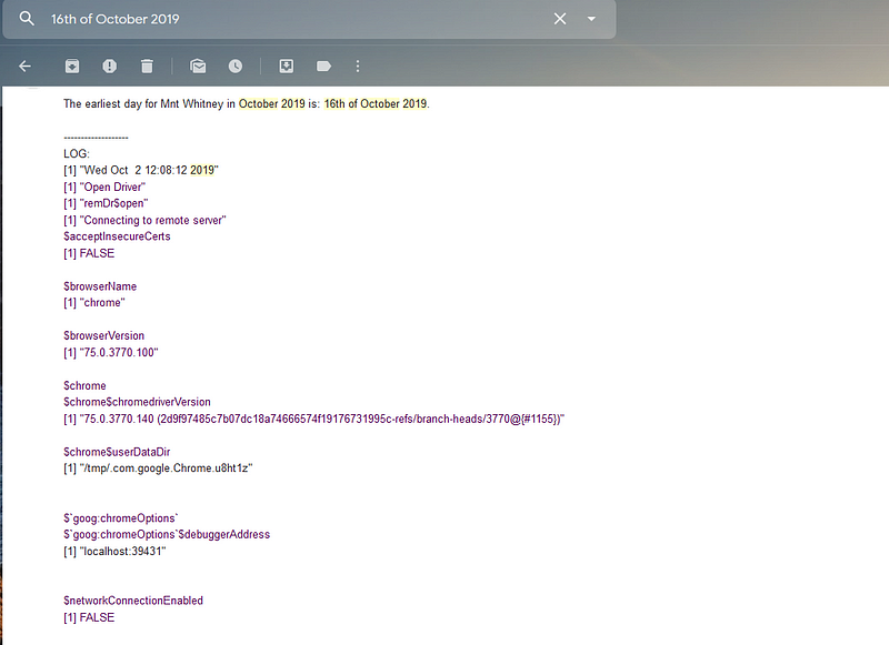
Scripting this piece really got me an email with a free slot and a permit to climb Mt Whitney:
email from Browser Automation
Browser automation can be helpful for use cases like this one. It helped me to get a permit. I did not overengineer it by scraping the website every few seconds or checking for specific dates. It was more of a fun project. You can think of a lot of ways to make it better. For example, it could send an email, if a date is available. But I wanted to get the log files every 12 hours, to see if something went wrong.
During the scraping, the website got updated once. So I received an error message from my scraper. I changed the script to the one presented in this blog post. The script may not work if you want to scrape Mt.Whitney pages tomorrow. Recreation.gov might have changed the website already.
I use browser tests to make my R-shiny apps safer. I work in a regulated environment and there these tests safe me a lot of time. This time I would have spent click-testing without such great tools as RSelenium or shinytest. Try it out and enjoy your browser doing the job for you.
Joe Cheng presented shinymeta enabling reproducibility in shiny at useR in July 2019. This is a simple application using shinymeta. You will see how reactivity and reproducibility do not exclude each other. I am really thankful for Joe Cheng realizing the shinymeta project.
Introduction
In 2018 at the R/Pharma conference I first heard of the concept of using quotations. With quotations to make your shiny app code reproducible. This means you can play around in shiny and afterward get the code to generate the exact same outputs as R code. This feature is needed in Pharma. Why is that the case? The pharmaceutical industry needs to report data and analysis to regulatory authorities. I talked about this in several articles already. How great would it be to provide a shiny-app to the regulatory authorities? Great. How great would it be to provide a shiny app that enables them to reproduce every single plot or table? Even better.
Adrian Waddell and Doug Kelkhoff are both my colleges of mine that proposed solutions for this task. Doug built the scriptgloss package which reconstructs static code from shiny apps. Adrian presented a modular shiny-based exploratory framework at R/Pharma 2018. The framework provides dynamic encodings, variable-based filtering, and R-code generation. In this context, I started working out some concepts during my current development project. How to make the code inside a shiny app reproducible? In parallel Doug, Joe Cheng and Carson Sievert worked on a fascinating tool called shinymeta, released on July 11 at the userR conference.
The tool is so fascinating because it created handlers for the task I talked about. It allows changing a simple shiny app into a reproducible shiny app with just a few tweaks. As shiny apps in Pharma have a strong need for this functionality, I am a shiny-developer in Pharma and I wanted to know: How does it work? How good is it?
Let’s create a shiny app relevant in Pharma
As a simple example of a shiny app in Pharma, I will use a linear regression app. The app will detect if a useful linear model can show a correlation between the properties of the patient and the survival rate. Properties of the patient are AGE or GENDER. Survival rates include how long the patient will survive (OS = overall survival), survives without progression (PFS = progression-free survival) or survives without any events occurring (EFS). Each patient can have had all three stages of survival. Let’s create the data sets for this use case with random data:
You can see that patient AGE and GENDER (SEX) are randomly distributed. The survival values in days should exponentially decrease. By these distributions, we do not expect to see anything in the data, but this is fine for this example.
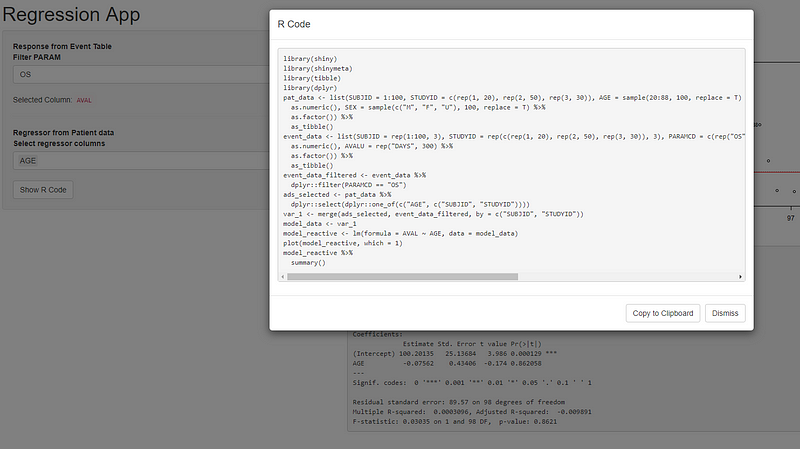
Simple app showing a linear regression of patient data
Inside the screenshot, you can see the app applied to this data. The app contains the regression plot and the summary of the linear model created with lm . It basically has one input to filter the event_data by PARAMCD. A second input to selects columns from the pat_data . The interesting part of this app is the server function. Inside the server function, there are just two outputs and one reactive value. The reactive performs multiple steps. It generates the formula for the linear model, filters the event_data, selects the pat_data, merges the data sets and calculates the linear model by lm . The two outputs generate a plot and a summary text from the linear model.
# Create a linear model
model_reactive <- reactive({
      validate(need(is.character(input$select_regressor), "Cannot work without selected column"))

      regressors <- Reduce(function(x, y) call("+", x, y), rlang::syms(input$select_regressor))
      formula_value <- rlang::new_formula(rlang::sym("AVAL"), regressors)

      event_data_filtered <- event_data %>% dplyr::filter(PARAMCD == input$filter_param)
      ads_selected <- pat_data %>% dplyr::select(dplyr::one_of(c(input$select_regressor, c("SUBJID", "STUDYID"))))

      anl <- merge(ads_selected, event_data_filtered, by = c("SUBJID", "STUDYID"))

      lm(formula = formula_value, data = anl)
    })

# Plot Regression vs fitted
output$plot1 <- renderPlot({
      plot(model_reactive(), which = 1)
    })

# show model summary
output$text1 <- renderPrint({
  model_reactive() %>% summary()
})
Of course, you think this app can be easily reproduced by a smart programmer. Now imagine you just see the user-interface and the output. What is missing? Two things are missing:
How to create the data?
What is the formula used for creating the linear model?
Let’s make the app reproducible!
By shinymeta and the approach of metaprogramming, we will make the whole app reproducible. Even if shinymeta is still experimental, you will see, right now it works great.
But we need to go step by step. The most important idea behind metaprogramming came from Adrian Waddell. Instead of adding code to your app, you wrap the code in quotations. (Step 1 and the most important).
Creating the data
We can use this for the data added to the app:
data_code <- quote({

  # Patient listing
  pat_data <- ...

  # Days where Overall Survival (OS), Event free survival (EFS) and Progression Free Survival (PFS) happened
  event_data <- ...
})

eval(data_code)
Instead of running the code, we wrap it into quote. This will return a call that we can evaluate after by eval . It enables reproducibility. The code that we used to produce the data sets is stored in data_code . We can later on reuse this variable. This variable will allow us to show how the data set was constructed.
Filtering and selecting the data
To enable reproducible filtering and selection we will use the shinymeta functions. Thus we will create a metaReactive returning the merged data set. A metaReactive behaves like a reactive with the difference, that you can get the code used inside back, afterward. This is similar to the principle of quotation. But for the metaReactive you do not need to use an eval function, you can basically stick to the () evaluation, as before.
An important new operator inside the metaReactive is the !! (bang, bang) operator. It allows inserting standard reactive values. It behaves a bit like in the rlang package. You can either use it to inline values from a standard reactive value. Or you can use it to inline metaReactive objects as code. As a summary the operator !! has two functionalities:
De-reference reactive objects — get their values
Chain metaReactive objects by inlining them as code into each other
Inside the code, you can see that the !! operator interacts with the reactive values input$select_regressor and input$filter_param as values. This means we de-reference the reactive value and replace it with its static value. The outcome of this reactive is the merged data set. Of course, this code will not run until we call data_set_reactive() anywhere inside the server function.
Creating the model formula
The formula for the linear model will be created as it was done before:
formula_reactive <- reactive({
  validate(need(is.character(input$select_regressor), "Cannot work without selected column"))
  regressors <- Reduce(function(x, y) call("+", x, y), rlang::syms(input$select_regressor))
  rlang::new_formula(rlang::sym("AVAL"), regressors)
})
It is necessary to check the select regressor value, as without a selection no model can be derived
Creating the linear model
The code to produce the linear model without metaprogramming was as follows:
lm(formula = formula_value, data = anl)
We need to replace formula_value and anl . Additionally replace the reactive with ametaReactive . Therefore we use the function metaReactive2 which allows running standard shiny code before the metaprogramming code. Inside this metaReactive2 it is necessary to check the data and the formula:
validate(need(is.data.frame(data_set_reactive()), "Data Set could not be created"))
validate(need(is.language(formula_reactive()), "Formula could not be created from column selections"))
The metaReactivedata_set_reactive can be called like any reactive object. The code to produce the model shall be in meta-programmed because the user wants to see it. The function metaExpr allows this. To get nice reproducible code the call needs to look like this:
If you do not want to see the whole data set inside the lm call we need to store it inside a variable.
To allow the code to be tracible, you need to put !! in front of the reactive calls. In front of data_set_reactive this allows backtracing the code of data_set_reactive and not only the output value.
Second of all, we can de-reference the formula_reactive by the !! operator. This will directly plug in the formula created into the lm call.
Third, bindToReturn will force shinymeta to write:
# Create a linear model
model_reactive <- metaReactive2({
validate(need(is.data.frame(data_set_reactive()), "Data Set could not be created"))
validate(need(is.language(formula_reactive()), "Formula could not be created from column selections"))
metaExpr(bindToReturn = TRUE, {
  model_data <- !!data_set_reactive()
  lm(formula = !!formula_reactive(), data = model_data)
})
})
Rendering outputs
Last but not least we need to output plots and the text in a reproducible way. Instead of a standard renderPlot and renderPrint function it is necessary to wrap them in metaRender . metaRender enables outputting metaprogramming reactive objects with reproducible code. To get not only the values but also the code of the model, the !! operator is used again.
# Plot Regression vs fitted
output$plot1 <- metaRender(renderPlot, {
  plot(!!model_reactive(), which = 1)
})

# show model summary
output$text1 <- metaRender(renderPrint, {
  !!model_reactive() %>% summary()
})
Using metaRenderwill make the output a metaprogramming object, too. This allows retrieving the code afterward and makes it reproducible.
Retrieving the code inside the user-interface
IMPORTANT!
Sorry for using capital letters here, but this part is the real part, that makes the app reproducible. By plugging in a “Show R Code” button every user of the app will be allowed to see the code producing outputs. Therefore shinymeta provides the function expandChain . The next section shows how it is used.
In case the user clicks a button, like in this case input$show_r_code a modal with the code should pop up. Inside this modal the expandChain function can handle (1) quoted code and (2)metaRender objects. Each object of such a kind can be used in the … argument of expandChain . It will return a meta-expression. From this meta-expression, the R code used in the app can be extracted. Simply using formatCode() and paste() will make it pretty code show up in the modal.
After going through all steps you can see that the code using shinymeta is not much different from the standard shiny code. Mostly metaReactive , metaReactive2 , metaExpr , metaRender , !! and expandChain are the new functions to learn. Even if the package is still experimental, it does a really good job of making something reactive also reproducible. My favorite functionality is the mixed-use of reactive and metaReactive . By using reactive objects inside meta-code the developer can decide which code goes into the “Show R Code” window and which code runs behind the scenes. You can check yourself by looking into the code of this tutorial. Of course this feature is dangerous, as you might forget to put code in your “Show R Code” window and not all code can be rerun or your reproducible code gets ugly.
This was the first time I tried to wrap my own work into a totally new package. The app created inside this example was created within my daily work berfore. The new and experimental package shinymeta allowed switching in ~1 hour from my code to metaprogramming. I did not only switch my implementation, but my implementation also became better due to the package.
Shinymeta will make a huge difference in pharmaceutical shiny applications. One week after the presentation by Joe Cheng I am still impressed by the concept of metaprogramming. And how metaprogramming went into shiny. The package makes shiny really reproducible. It will give guidance for how to use shiny in regulatory fields. Moreover, it will allow more users to code in R, as they can see the code needed for a certain output. Clicking will make them learn.
Analyzing STRAVA data to find out which city has the faster cyclists with R and R-shiny. My contribution to the shiny contest.
STRAVA is one of the most popular fitness tracking apps. It not only allows users to track their own activities but also following professionals. STRAVA made running and cycling a game for everybody. It split the world into segments. Each segment can be seen as a tiny race-track. STRAVA runs a leaderboard for each track. Now you will know how fast you are compared to others, without even running a real race. Just do it in a digital way. This feature was what I used to find out, which city in Europe has the fastest cyclists. Why all that? I wanted to participate in the R-Shiny Contest.
Before I start explaining how to find the fastest city, I have to say. There is no fastest city in Europe. The average speed of a city really depends on how you evaluate the city. London is really fast at a short distance, Paris on long distance, Munich people seem to be good climbers… Every one of those settings can be evaluated inside my app. So let’s start from the beginning.
Getting the data
I decided on four cities that I wanted to compare. The STRAVA API allows for 13,000 API calls a day, meaning 13,000 questions you can ask STRAVA on, for the non-programmers. This was my most limiting fact. I chose 4 cities, London, Paris, Berlin, and Munich (because I live here). Each city got split into squares of ~100m x 100m. For these squares, I called the API to get to know which STRAVA segments can be found here. In London, I found e.g. ~2000 segments by 9000 squares. For each of those segments, I called the API twice. Once for the leaderboard of the 30 fastest male cyclists and again for the leaderboard of the 30 fastest female cyclists. From these values, I calculated the average and median for male, female and both per segment. This is the data to start the calculations from.
Inside my app, at http://citycyclerace.engel-wolf.com you can use this data to compare cities. The app will use a basic setting to compare London against Paris and London will win the race. But now you can start changing settings to see if London is really the faster city.
Compare cities in different ways
The settings window allows e.g. changing the length of STRAVA segments. You can see if London people are better sprinters by choosing 0.0 to 1.0 km as the segment length. Or check out if Munich people are good on long distance segments by choosing 5.0–20.0 km segment length.
Settings window inside the shiny app for cycle races
What also changes the settings a lot is whether you use average or median evaluation. The median tells you the speed of the 15th person inside your leaderboard assuming a distribution of your leaderboard. So actually, how fast will 50% of people on the leaderboard be indeed? While the average just takes the speed of each participant and divides it by the number of participants. A fast guy on place1 can move your board up front, which cannot happen on median calculations.
A great feature is the elevation factor. It adds a linear weight to the speed depending on how steep a segment is. The speed of a steeper segment gets increased by the formula: speed = elevation_factor * 0.1 * climb (in meters). This means the steeper your segment, the higher the speed is.
Last but not least you can run the whole calculation just for men or women.
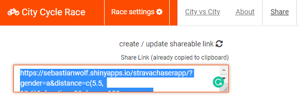
All settings can be stored and shared using the share feature of the app.
Visual features
To compare the speed of the city I built in an animated bar plot. This one is based on the jQuery plugin simple skill bar. In R it has to be added as to be added as a specific output binding. Finally the speed of each city get’s animated:
To visualize the segments that are used for the evaluation, I implemented a leaflet map within the app. The map does not only show the segments. It also highlights the speed of a segment. Moreover, users can access the STRAVA website to see details of the segment:
If users would like to see if a city has maybe faster people on longer or shorter segments, it is not needed to change the settings. Additionally, graphs plot the calculated speed for different length:
Play on
I hope you can now see, that there is no fastest city. It really depends on how you set up the features of this app. Please start enjoying the app. Here are some last facts about the app and please upvote it on the Shiny Contest Page.
# of segments in the app 421,685
# of segments with average speed (leaderboard crawled) 22,589
Die Hot8 Brass Band hat sich endlich einmal in München sehen lassen. Meiner Meinung nach ist sie ja die beste Brass-Band der Welt, da bin ich gerne zum Streit bereit. Sowas wird bestimmt eine lustige Diskussion.
Aber meine Güte gehen die Jungs steil! Eigentlich ist bei jedem Song das Publikum mit vollem Einsatz gefragt. Es kann sein, das man nur heftig tanzen muss, aber man kann auch lernen aus voller Seele (mit Soul) “AAAHRRR” zu schreien. Wow.
Künstlerisch hat die Band natürlich einiges drauf. Mitten in diverse Songs werden großartige Soli eingebaut. Daneben können sie mit 8 Leuten mindestens 8 Stimmen spielen, ohne das das ganze unmelodisch wird. Die Tuba dient dabei weiterhin als Rhythmus Instrument, so das Basedrum und Snare völlig freie Fahrt haben.
Mein Lieblingsmoment war natürlich der, als sie einen Fan auf die Bühne holten, weil er trotz Krücken voll am Start war und bei “get on down” tatsächlich auf die Knie ging. Dafür gab’s ein Bandshirt und einen Musikwunsch. Mit “Rasta Funk” wünschte er sich einen Reggae song, bei dem man auch gut tanzen kann.
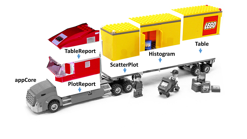
How to Build a Shiny “Truck” part 2 — Let the LEGO “truck” app pull a trailer. An example of a modularized shiny app.
In September 2018 I used an automotive metaphor explaining a large scale R shiny app. RViews published the article. I would summarize the article in one phrase. Upon building large applications (trucks) in R shiny there are a lot of things to keep in mind. To cover all these things in a single app I’m providing this tutorial.
The article I wrote in RViews told the reader to pay regard to the fact that any shiny app might become big someday. Ab initio it must be well planned. Additionally, it should be possible to remove or add any part of your app. Thus it has to be modular. Each module must work as a LEGO brick. LEGO bricks come with different functionalities. These bricks follow certain rules, that make them stick to each other. These rules we call a standard. Modules designed like LEGO bricks increase your flexibility. Hence the re-usability of your modules grows. When you set up your app to like that, you have the possibility to add an unlimited number of LEGO bricks. It can grow. Imagining small scale applications like cars. Large scale applications are trucks. The article explained how to build a LEGO truck.
If you build your car from LEGO / more and different parts can make it a truck.
If you built your app from standardized modules / you have the flexibility to insert a lot more functionalities.
A modularized shiny app — Where to start?
The image below explains the idea of the modularized shiny app.
You start with a core shiny application. See it like the chassis of your car. It’s made of LEGO. Any other part made of LEGO a stick to your chassis. Such parts can change its functionality. Different modules will help you build different cars. Additionally, you want to have a brick instruction (plan). The plan tells which parts to take and to increase flexibility. The back pages of your brick instruction can contain a different model from the same bricks. If you can build one app from your modules, you can also build a different app containing the same modules. If this is clear to you, we can start building our app in R-shiny:
Implementation rules:
Each module is an R package
The core R package defines the standardization of bricks
The core app is a basic shiny app
The brick instruction (plan) file is not in R
Why these rules exist, will become clear reading the article.
The app we want to build
The app we want to build will create different kinds of outputs from a panel of user inputs. These different outputs will show up inside the app. Additionally, all outputs will go into a PDF file. The example will include two plots in the plot module and one table in the table module. As each module is an R-package, you can imagine adding many more R-packages step by step. A lot of outputs are possible within shiny. The main feature of this app is the possibility to add more and more modules. More modules will not screw up the PDF reporting function or the view function. Modules do not interact at all inside this app.
The core R-package
The core package contains the structure that modules have to follow to fit into the core app. There are two kinds of structures that we will define as R-S4 classes. One that represents modules and one that represents output elements in those modules.
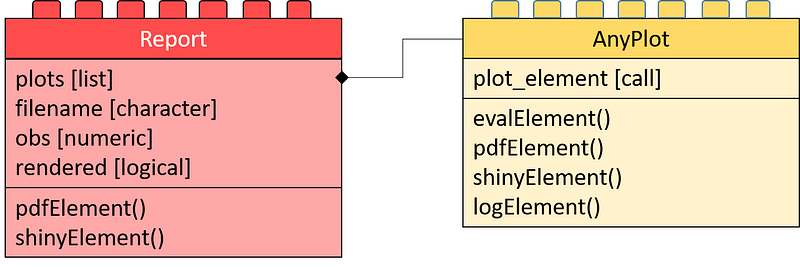
Class diagram of the core application: The left side shows the reports. The app can generate each of those. Each contains a list of elements to go into the report (plots). The right-hand side contains the class definition of such elements. Each element is of kind AnyPlot. This class contains a call (plot_element) that produces the element upon calling evalElement.
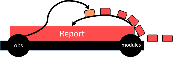
For task one, we call the object (class) a Report. The Report is the main brick we define in the core app. It contains:
plots — A list of all elements shown in the report
filename - The name of the output file (where to report to)
obs - The handling of the input value input$obs
rendered - Whether it shows up in the app right now
Additionally, the Report class carries some functionalities to generate a shiny output. Moreover, it allows creating PDF reports. The functionalities come within the methods shinyElement() and pdfElement() . In R-S4 this looks like this:
Now we would also like to define, how to structure each element of the Thus . Thus we define a class AnyPlot that carries an expression as it’s the only slot. The evalElement method will evaluate this expression. The pdfElement method creates an output that can go to PDF. The shinyElement creates a PlotOutput by calling shiny::renderPlot(). The logElement method writes the expression into a logFile. The R-S4 code shows up below:
To keep this example simple, the core app will include all inputs. The outputs of this app will be modular. The core app has to fulfill the following tasks:
have a container to show modules
Read the plan — to add containers
include a button to print modules to PDF
imagine also a button printing modules to “.png”, “.jpg”, “.xlsx”
include the inputs
Showing modules
For task one we use the shinyElement method of a given object and insert this in any output. I decided on a Tab output for each module. So each module gets rendered inside a different tab.
Reading the plan
Now here comes the hard part of the app. As I said I wanted to add two modules. One with plots and one with a table. The plan (config.xml) file has to contain this information. So I use this as a plan file:
You can see I have two modules. There is a package for each module. Inside this package, a class defines (see section module packages) the output. This class is a child of our Report class.
The module shows up as a tab inside our app. We will go through this step by step. First, we need to have a function to load the packages for each module:
As we now have these two functions, we can iterate over the XML file and build up our app. First we need a TabPanel inside the UI such as tabPanel(id='modules') . Afterwards, we can read the configuration of the app into the TabPane . Thus we use the appendTab function. The function XML::xmlApply lets us iterate over each node of the XML (config.xml) and perform these tasks.
configuration <- xmlApply(xmlRoot(xmlParse("config.xml")),function(xmlItem){
    load_module(xmlItem)

    appendTab("modules",module_tab(xmlItem),select = TRUE)

    list(
      name = xmlValue(xmlItem[["name"]]),
      class = xmlValue(xmlItem[["class"]]),
      id = xmlValue(xmlItem[["id"]])
    )
  })
Each module is now loaded into the app in a static manner. The next part will deal with making it reactive.
Rendering content into panels
For Dynamic rendering of the panels, it is necessary to know some inputs. First the tab the user chose. The input$modules variable defines the tab chosen. Additionally the outputs of our shiny app must update by one other input, input$obs . So upon changing the tab or changing the input$obs we need to call an event. This event will call the Constructor function of our S4 object. Following this the shinyElement method renders the output.
The module class gets reconstructed up on changes in the input$modules or input$obs
# Create a reactive to create the Report object due to
  # the chosen module
  report_obj <- reactive({
    module <- unlist(lapply(configuration,function(x)x$name==input$modules))
    if(!any(module))module <- c(TRUE,FALSE)
    do.call(configuration[[which(module)]][["class"]],
            args=list(
              obs = input$obs
    ))
  })

  # Check for change of the slider/tab to re-calculate the report modules
  observeEvent({input$obs
    input$modules},{

      # Derive chosen tab
      module <- unlist(lapply(configuration,function(x)x$name==input$modules))
      if(!any(module))module <- c(TRUE,FALSE)

      # Re-render the output of the chosen tab
      output[[configuration[[which(module)]][["id"]]]] <- shinyElement(  report_obj() )
    })
The reactive report_obj is a function that can call the Constructor of our Report object. Using the observeEvent function for input$obs and input$modules we call this reactive. This allows reacting on user inputs.
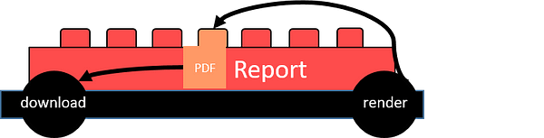
Deriving PDF files from reports
Adding a PDF render button to enable the download of PDF files.
The pdfElement function renders the S4 object as a PDF file. If this worked fine the PDF elements add up to the download button.
An extra label checks the success of the PDF rendering.
# Observe PDF button and create PDF
  observeEvent(input$"renderPDF",{

    # Create PDF
    report <- pdfElement(report_obj())

    # If the PDF was successfully rendered update text message
    if(report@rendered){
      output$renderedPDF <- renderText("PDF rendered")
    }else{
      output$renderedPDF <- renderText("PDF could not be rendered")
    }
  })

  # Observe Download Button and return rendered PDF
  output$downloadPDF <-
    downloadHandler(
      filename =  report_obj()@filename,
      content = function(file) {
        file.copy( report_obj()@filename, file, overwrite = TRUE)
      }
    )
We finished the core app. You can find the app here: app.R and the core package here: core.
The last step is to put the whole truck together.
Module packages
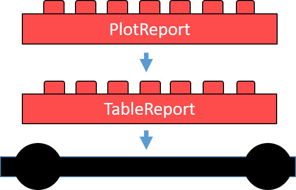
The two module packages will now contain two classes. Both must be children of the class Report. Each element inside these classes must be a child class of the class AnyPlot. Red bricks in the next picture represent Reports and yellow bricks represent AnyPlots.
Final app: The truck consists of a core app with a PlotReport and a TableReport. These consist of three AnyPlot elements that the trailer of the truck carries.
Plot package
The first module package will produce a scatter plot and a histogram plot. Both are children of AnyPlot by contains='AnyPlot' inside there class definition. PlotReport is the class for the Report of this package. It contains both of these plots inside the plots slot. See the code below for the constructors of those classes.
The table package follows the same rules as the plot package. The main difference is that there is only one element inside the plots slot. This one element is not a plot. That is why it contains a data.frame call as its expression.
To render a data.frame call inside shiny, we have to overwrite the shinyElement method. Instead of returning a renderPlot output we will return a renderDataTable output. Additionally the pdfElement method has to return a gridExtra::grid.table output.
A major advantage of packaging each module is the definition of dependencies. The DESCRIPTION file specifies all dependencies of the module package. For example, the table module needs the gridExtra package. The core app package needs shiny, methods, XML, devtools . The app does not need extra library calls. Any co-worker can install all dependencies
Final words
Now you must have the tools to start building up your own large scale shiny application. Modularize the app using packages. Standardize it using S4 or any other object-oriented R style. Set the app up using an XML or JSON documents. You’re good to go. Set up the core package and the module packages inside one directory. You can load them with devtools and start building your shiny file app.R . You can now build your own app exchanging the module packages.
Like every kid, you can now enjoy playing with your truck afterward and you’re good to go. I cannot tell you if it’s more fun building or more fun rolling.
Dear Reader: It’s always a pleasure to write about my work on building modular shiny apps. I thank you for reading until the end of this article. If you liked the article, you can star the repository on github. In case of any comment, leave it on my LinkedIn profile http://linkedin.com/in/zappingseb.
Travis CI is a common tool to build R packages. It is in my opinion the best platform to use R in continuous integration. Some of the most downloaded R packages built at this platform. These are for example testthat, magick or covr. I also built my package RTest at this platform. During the setup I ran into some trouble. The knowledge I gained I’m sharing with you in this guide.
The article “Building an R Project” from Travis CI tells you about the basics. It allows setting up a build for an R-package or R project. The main take away comes with this .travis.yml file.
# Use R language
language: r
#Define multiple R-versions, one from bioconductor
r:
  - oldrel
  - release
  - devel
  - bioc-devel
# Set one of you dependencies from github
r_github_packages: r-lib/testthat
# Set one of your dependencies from CRAN
r_packages: RTest
# set a Linux system dependency
apt_packages:
  - libxml2-dev
The tutorial explains to you that you should setup your type language as R. You can use different R-versions. Those R-Versions are:
Additionally you can load any package from github by r_github_packages . Or you can get any package from CRAN by r_packages . A list of multiple packages can be created using the standard yml format:
r_packages:
  - RTest
  - testthat
In case you have a Linux dependency, it needs to be mentioned. The RTest package uses XML test cases. The XML Linux library needed is libxml2 . It can be added by:
apt_packages: - libxml2-dev
You are done with the basics. In case you have this .travis.yml file inside your repository, it will use R CMD build and R CMD check to check your project.
Modifying R CMD commands
To build my project I wanted to build it like on CRAN. Therefore I needed to change the script of the package check. Therefore I added:
script:
  - R CMD build . --compact-vignettes=gs+qpdf
  - R CMD check *tar.gz --as-cran
Inside this script you can changeR CMD build orR CMD check arguments. For a list of arguments to R CMD see this tutorial from RStudio.
Travis CI offers two different operating systems right now (Jan 2019). Those are macOS and Linux. The standard way of testing is Linux. For my project RTest I needed to test in macOS, too. To test in two operating systems use the matrix parameter of Travis CI.
The matrix parameter allows adjusting certain parameters for certain builds. To have the exact same build in Linux and macOS I used the following structure:
The matrix function splits the build into different operating systems. For macOS I used the image xcode7.3 as it is proposed by rOpenSCI. An extra point for this version is that it is close to the current CRAN macOS version. As you can see you should install the Latex packages framed and titling to create vignettes.
Run scripts with User interfaces
My package RTest uses Tcl/Tk user interfaces. To test such user interfaces you need enable user interfaces in Linux and macOS separately. Travis CI provides the xvfb package for Linux. For macOS you need to reinstall xquartz and tcl-tk with homebrew .
To use xquartz there is no xvfb-run command under macOS. In a github issue I found a solution that still makes user interfaces work with xquartz .
before_script:
      - "export DISPLAY=:99.0"
      - if [ "${TRAVIS_OS_NAME}" = "osx" ]; then ( sudo Xvfb :99 -ac -screen 0 1024x768x8; echo ok ) & fi
You create a display before running any R script that can be used by the R session. It is important to export the DISPLAY variable. This variable is read by the tcktk R package.
In macOS you do not need to change the script
script:
      - R CMD build . --compact-vignettes=gs+qpdf
      - R CMD check *tar.gz --as-cran
Addon
For more information on user interfaces you can read these two github issues:
For code coverage I would suggest to use one specific version of your builds. I decided for Linux + r-release to test the code coverage. First of all I added the covr package to my build script:
r_github_packages:
  - r-lib/covr
Secondly I wanted to test my package using covr. This can be done in Travis using the after_success step. To use covr inside this step you need to define how your package tarball will be named. You can write this directly into your script. A better way to do it is to write it into the env part of you .travis.yml file. The name of your tarball will always be PackageName + “_” + PackageVersion + “.tar.gz”. Inside your DESCRIPTION file you defined PackageName and PackageVersion. I used CODECOV to store the results of my coverage tests.
The setup I’m using for my package includes code coverage for all my examples, vignettes and tests. To deploy the results of the code coverage you must define the global variable CODECOV_TOKEN . The token can be found under https://codecov.io/gh/<owner>/<repo>/settings . You can insert it secretly into your Travis CI build. Add tokens inside https://travis-ci.org/<owner>/<repo>/settings . The section environment variables stores variables secretly for you.
To use COVERALLS instead of CODECOV use the covr::coveralls function and define a COVERALLS_TOKEN inside your environment.
Build and deploy a pkgdown page to github pages
Building a pkgdown page can be really useful to document your code. On my github repository I also host the pkgdown page of my package RTest. You can find the page here: https://zappingseb.github.io/RTest/index.html
To allow deployment to github pages I activated this feature at: https://github.com/<owner>/<repo>/settings. You have to use the gh-pages branch. If you do not have such a branch you need to create it.
Inside the .travis.yml you start by installing pkgdown.
r_github_packages:
  - r-lib/pkgdown
You will have to build the page from your package tarball. The name of the package tarball has to be defined. Please see the section code coverage for how this is done. After unpacking the tarball you should delete any leftovers from checking the package by rm -rf <PackageName>.Rcheck .
The Rscript will produce the website inside adocs folder. This folder must be deployed on github pages.
First go to to https://github.com/settings/tokens when you’re logged into github. There you have to create a token with public_repo or repo scope. Now store this token inside your Travis CI build. Therefore go to https://travis-ci.org/<owner>/<repo>/settings and store it as a global variable named GITHUB_TOKEN . The website will now be deployed on every successful build using this script:
Inside the travis-ci-community there was a question on how to install the magick package on Travis-CI. The answer is simple. You need to have all system dependencies of ImageMagick. Install these for Linux by:
Dear Reader: It’s always a pleasure to write about my work on continuous integrations. I thank you for reading until the end of this article. If you liked the article, you can star the repository on github. In case of any comment, leave it my LinkedIn profile http://linkedin.com/in/zappingseb.