Music listener statistics: last.fm’s last.year as an R package
When starting analyzing last.fm scrobbles with the last.week and last.year function I was always missing some plots or a pure data table. That is why I developed the package “analyzelastfm” as a simple R6 implementation. I wanted to have different album statistics, as e.g the #of plays per album, divided by the # of tracks on the album. This is now implemented. To get music listening statistic you would start with:
# If you don't have it, install devtools
# install.packages("devtools")
devtools::install_github("zappingseb/analyze_last_fm")
library(analyzelastfm)
First it allows you to import your last.year data by using the last.fm REST API. Therefore you need to have a last.fm API key. This can be derived by simply going to the last.fm API website. From there you will get the 32 character long key. After receiving the key I got my last.fm data by:
api_key <- "PLEASE ENTER YOUR KEY HERE"
data <- UserData$new("zappingseb",api_key,2018)
The data object now contains the function albumstats that allows me to get the specific information I wanted. I’ll exclude the artist “Die drei ???” as it’s a kids detective story from Germany I listen to a lot and which’s albums are split into 1 minute tracks, that really screws up my statistic.
View(data$albumstats(
  sort_by="by_album_count", # album track plays / nr tracks on album
  exclude_artist="Die drei ???", # exclude my audio book favorite
  exclude_album=c(""), # exclude tracks without album name
  min_tracks=5) # have minimum 5 tracks on the album (NO EPs)
)
The result looks like that:
 Album statistics of 2018 of zappingseb
The statistic shows n the number of plays, count the number of tracks on the album and count_by_track=n/count .
The top 5 albums you can find here:
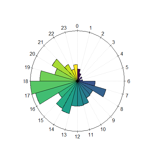
Additionally to such calculations, I was also interested in when I was listening to music. Therefore I added some plots to the package. The first one is the listening clock:
data$clock.plot()
 Clock plot for my music history
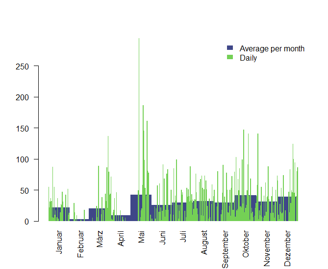
I listen to music mostly on my way to work on the bike between 7 and 8 am and between 5 and 6 pm. My most important statistic though is which time of the year I spent listening to music. I’m most interested in some specific days and an average play/month, that can tell me in which mood I was in. Therefore I created the function daily_month_plot . It plots the average plays per month and the daily plays in one plot. The average plays per month are visualized behind the daily spikes. Here you can see that February was a really quiet month for me.
data$daily_month_plot()

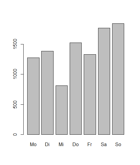
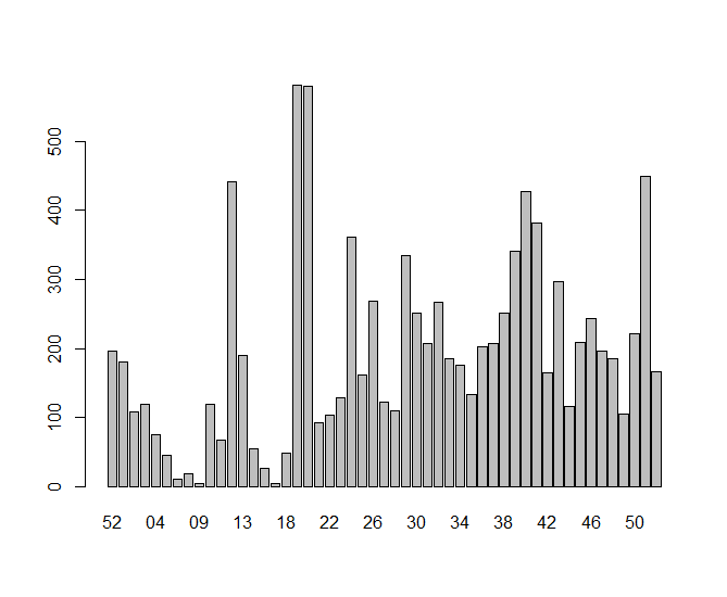
For some simple statistics, I also included an aggregation plotting function called barplots . It can plot aggregations per weekday, week, month or day. The data for this function is provided by the function bar_data .
data$barplots("weekdays")

weekly (starting with week 52 of 2017):
data$barplots(“week”)

Where I can clearly see that I was not really listening to a lot of music during the beginning of the year and my listening activity increased dramatically by week 18.
This post is a bit out of my spectrum, which mostly deals with packages about R packages being useful for Pharma. But I really like music and think music and data science make a good combination. Sound’s great together!
Please find the R package at: https://github.com/zappingseb/analyze_last_fm — never too late to star it 😉